Here’s a couple other designs I have in mind for upcoming HM merch:
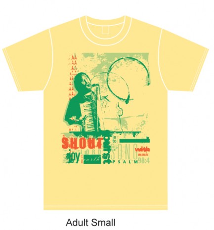
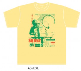
Okay, this one will look VERY familiar, but it features the “correct” shirt color/background to match the original “back page” from HM Magazine, Issue #124:
So, whattya think? If you’re curious as to what it would look like, perspective-wise on a larger, Adult XL-size shirt, I will paste an image of that below.
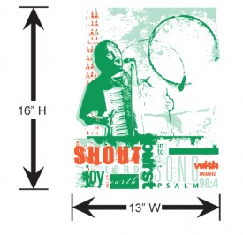
And, if you need another look at the ink-only image (knowing that the shirt color acts as the background of the image), you can see that way down at the bottom here.
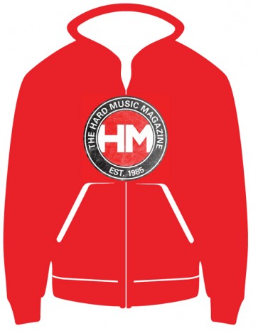
Next up is a red zip-hoodie idea of mine. I have “stressed” the logo image, so that it looks like a beat up, old and worn shirt. Genius, huh? hahaha. Whattya think of this one?
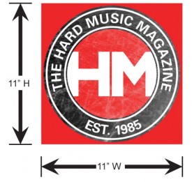
Now, here are examples of just the raw designs (ink imprint versions):
Comments