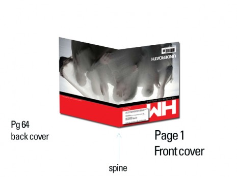
So, yesterday we showed you a sneak peek at the new cover. Well, here is the “back” cover, which helps the front cover make sense:
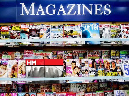
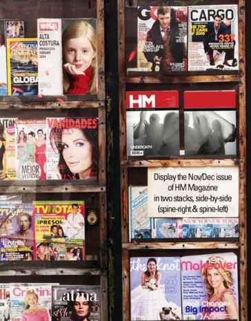
I fell in love with the wide (spread) photo and then the left-of-field crazy design notion of making this the cover with the front on the back (at least if you think of the “front” equaling the brand/logo/masthead and all that stuff). I drafted an email for retailers to show them how to best display this magazine on the shelf.
These are the “two covers” side-by-side. It’s really just one version, but one is shown with the “spine” on the right and the other with the more-common spine on the left orientation. In other words, one is the front and the other the back.
So, there you have it.
But the drama did not start until today. My printer asked me where I wanted the mailing label placed for the copies mailed to subscribers. I thought about it, but after realizing that the regulations regarding the mailing label placement on front (spine-left) and back (spine-right) are different. If it is to be placed on the back, it must be on the upper portion of the cover. That would look weird – the mailing label basically at the top or middle of the cover. So, I told him lower left on the “front,” which is basically a weird-looking blank masthead and bizarre photo with pretty much no text on it.
But I got a message from my printer that he was checking out the regulations on this unique cover … and it turns out that there is a national postal regulation regarding my mailing permit (which is “Periodical” rate, which goes right behind First Class). The label cannot be on a cover that does not include the logo/masthead identifying marks. In other words, my cover is too different and too weird to be allowed.
What?!
Yeah, that was my reaction. How stifling is that kind of rule! No post office is going to tell me how to design my magazine! I’m sorry, but this is one that I’m willing to throw down over. “Without logos and other identifying marks that distinctly tell readers that this is your magazine, it cannot be the front cover.” I was told that, basically.
In case you haven’t caught on yet, the “spine” (the side that the staples are on) needs to be on the left side of the cover to be considered the “front.” I couldn’t believe the audacity and ridiculous nature of this regulation. I contacted my printer today and went over the options:
a) resist and fight and mail it out as-is. The likely result? It gets rejected and sits in a mailroom, undelivered.
b) print up some envelopes and insert the “contraband” covers in the envelopes and mail out that way.
c) put the mags in a “polybag” plastic wrap around the cover, along with a “label carrier” or “on-sert” or “poly outsert.”
d) print an entirely different cover for subscribers only to comply with the regulation.
All of these options, of course, mean more money required. This is a tough detail in the face of the limited income we find our magazine making these days. I start to work on the polybag and alternate cover options. I tell my printer that I’m going to tinker with some designs that’ll comply and explore the alternate cover idea. As I’m messing with some of my ideas, one of which was flipping the logo backwards, I just flipped each of the pages upside-down … and then it hit me.
Wait a minute! If we just turn the magazine as designed upside-down, then the magazine logo and the identifying marks are all on the front (spine-left) side. Problem solved. At least that is what I hope to confirm early this morning. I’m composing this email on Thursday night, so by the time I post this live I should know the outcome. For the regulatory commission’s sake (they’re not really called a commission) I designed this image to show what I’m talking about.



Comments