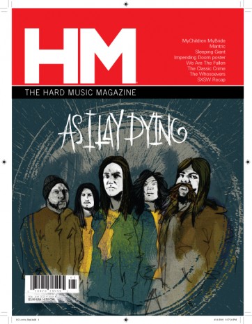
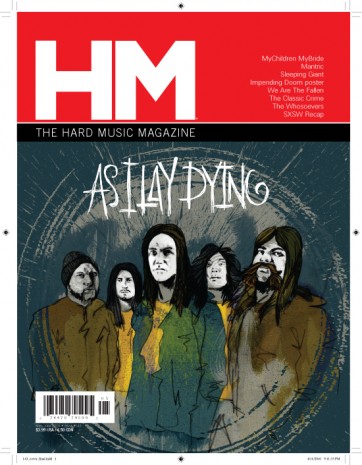
I could use your help. Here are three different variations on how to “deal” with the barcode and this new issue’s illustrated cover. (look in the lower left corner…)
…or perhaps…The dirty, tweaked look?
…or maybe the clean, smallbox look?
Please give me your opinions and thoughts (comment below).
Thanks!
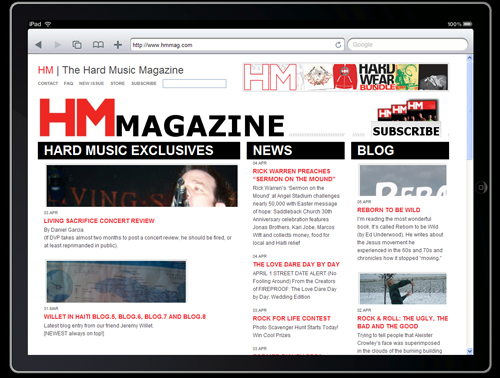
Also, if you were curious as to what the hmmag.com website looks like on the iPad, here’s an image of it. You can go to this cool website (called ipad peek) and type in the url of any site and see how it’ll fit and look.


Comments