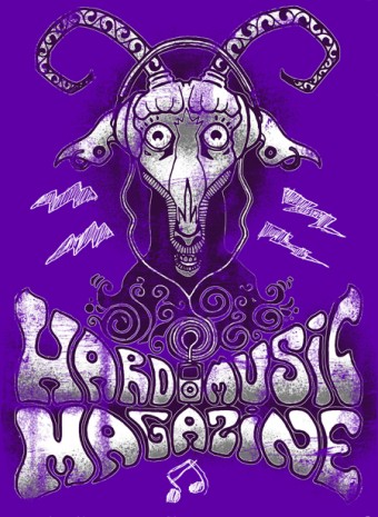
Alright. We’ve got more previews to look at for our new shirt design.
We kinda decided we want to shoot for a purple shirt fabric, so these design previews are against a purple background.
Whattya think? Do you like the goat? What about the “stressed” look (like an old, faded shirt) on the text? Do you like the lightning bolts and the eighth-note hanging there? (I think that’s what it is…)


Comments