“Everything was looking up for Doug and the young magazine, but he had no idea that a new genre of music was bubbling beneath the surface.
“Next, on Behind The Music…”
“Disco burst on the scene without any warning,” states internet radio mogul John Cosnowski. “We never saw it coming.” Cosnowski was part of a foiled shoplifting plot at the Edwards Air Force Base Exchange back in 1978. It was a warm high desert day in Southern California’s Mojave Desert.
“I’ll never forget the look on John’s face as he broke down and confessed our clever scheme to disguise new vinyl as albums checked out from the base library,” relates Van Pelt. “The look his mom gave me the next day was horrific. It’s like I was the bad influence. It was true, I guess, but…”
Okay, I guess it’s time to stop being “creative” and start sharing more insight behind the deadline period at HM Magazine (I wasn’t exactly walking with Jesus when I was in high school…).
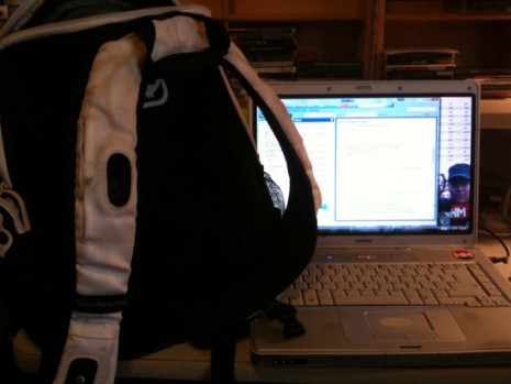
The first thing I do each day when I enter the office is plop my backpack down and unload its contents. I bring my notebook home with me each day from the office… and my name is Doug and I’m a workaholic. Having a notebook at home (with helpful software programs like Outlook, Word, InDesign and Photoshop) allows me to take work home with me and gettirdone…
Notice that the wallpaper background on the desktop of the notebook is an image with our new ad rates. I decided to lower our ad rates back in September. While normally rates go up and up each year, I’ve classically left mine the same for long patches of time (as in years and years). With the music economy going South a couple of years ago, marketing expenditures have taken a dip with music magazines. The overall magazine business has taken its own trip South on the heals of the music industry and some have predicted dark days ahead and even the death of print. I don’t quite buy that theory, but I figured lowering our prices a bit might be a gesture that pays off. I’m not sure my plan has worked, but I just don’t have the new rates memorized like the old ones. Having them on my computer’s screen is handy for those times when I need a price and can’t remember it.
You might notice a wooden bookshelf in the background. These are a couple old crates that hold CDs really well. I have a couple stacks for the albums we’re reviewing in this issue. On top of that shelf are some CDs of bands that we’re considering doing “So & So Says” interviews with. To the left of that stack (like it matters), I keep some CDs that might get talked about in the “Spinning at HM” section underneath the Editor’s Note section on the table of contents. Some of these albums might be late arrivals that come too late to be planned for, assigned and then reviewed. An album that might not be as “qualified” for a review, like a compilation album, might end up here, too. One of the first things we do after deadline is file away all the CDs we wrote about in this issue. There are three large book shelves and two smaller ones, where we keep all the CDs we’ve covered in the recent past (and a few from the distant past). They’re filed alphabetically and chronologically. It’s fun to see a huge stack from bands that have been at it for a long time — like MxPx or Mortification.
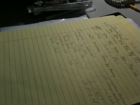
One way we keep track of such a large project is to make lots of “To Do” lists. Ruled notepads are a regularly used office supply around here. With so many details, it’s easy to get distracted by one and get consumed with a detail and neglect moving on to another necessary thing. Writing down what needs to get done helps me stay on task and it also feels good to check off plenty of things by the end of a day.
A couple things here include some assignments we gave Daniel, like the Groovemaker iPhone app and a book by Showbread frontman Josh Dies, called Nevada. Above a few “To Do” items are little marks that keep track of the cusswords and scenes of gore from the movie Zombieland. It was a riotous and funny movie. It looks like there were 37 cusswords in the movie (mostly the f-word) and 120 scenes of gore. The second was actually a rough estimate on the number of up-close and “personal” appearances of zombie creatures, with blood and bodily fluids gushing out from open sores.
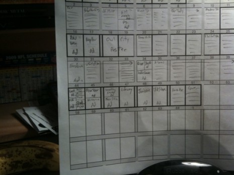
Next up in a fancy little “copy holder” is our “page layout schemata.” At least that’s what I call it. It’s a thumbnail sketch of all 64 pages. If you look closely, you’ll see we’ve got a poster of Owl City, along with a nice big 4-page feature on Demon Hunter. It’s fun to devote extra space and lots of words on a band with a lot to offer. Our “So & So Says” feature is with a band called The Used. This was one of those semi-rare sit-down, face-to-face interviews (as opposed to the normal “phoner” we do). It took place at Austin’s La Zona Rosa club, which hosted The Almost at the show that night, too. I’ll place ads in specific spots (like the first 8 pages of color and the last 8 pages).
I’m always amazed by a little detail that seems to happen with each issue. It’s the way the color from one ad matches the color of the ad opposite it. This is not planned with the ad design or color in mind. I pencil in the ad placement based upon fairly random factors, like the particular client paying extra to be in a certain spot (like T&N does with the opening spread on pages 2 and 3) and also factors like “Oh, this client was in the back last issue, let’s put them up front this time.” It’s like a tiny little miracle that each spread matches the opposite pages like it was planned — even though it’s the first time they’ve “met.”
Watch, I’ll jinx it by bringing it up now. The next issue will probably look awful, with garish blues next to browns and oranges opposite. Or pinks and greens. ha ha
Note there’s a banana next to the page layout schemata. You can’t ever get enough healthy food when you’re putting in long hours. I remember an old friend (and first employee) Charles Gates once telling me I ought to stock up on healthy food, like apples, oranges and nuts during deadline. He saw me buying Hostess cupcakes or something decadent at the time. I ignored him then, but I still hear his voice in my head; so I count it as good advice.
You’ll also see an NFL 2009 schedule back there. Football is important, you know. The Super Bowl is this Sunday. And tomorrow is the Super Duper Bowl. At least that’s what our church calls it. This is the second annual “grudge match” that we’re playing against our sister church from College Station, TX. Our church is Calvary Chapel of Austin. The other team is from Calvary Chapel Aggieland. Last year they tore us up on a bitterly cold and windy day – 34 to 6. They took home a duct tape covered football as the trophy. This year we are hoping to exact revenge. This year we have a coach. That’s me. I’m going to be Dan Reeves. You might know him as the former coach for the Atlanta Falcons. Before that job he coached the Denver Broncos. Prior to that, he was one of those very rare “player/coaches” with the Dallas Cowboys. Like his head coach, Tom Landry (who acted like a player/coach when he was on the New York Giants, later becoming the Defensive Coordinator as another fella named Vince Lombardi was the Offensive Coordinator for the team. Some other guy who’s name I can’t recall was the head coach. So, I’ve developed an offense and defense we’ll be running … and I hope to run a few plays myself — especially when my friendly rival David Reynolds is lining up across me. I posted a 30-second video of my trip to the field today at the end of work. I’ll try to remember to record something tomorrow at the game.
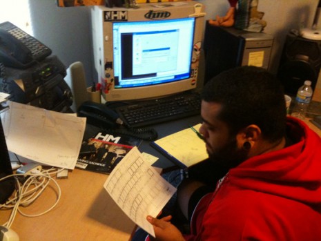
Here’s editorial team member* Daniel Garcia looking over the page layout schemata. (I prefer to use this term rather than “intern,” because some internships are nothing more than glorified go-fer positions that pad resumes and involve making copies and getting coffee. Our interns write major features and help decide content. They get real-time experience and make real-time decisions with real risks and consequences. Take that, IBM!)
I just gave him the assignment of placing the ads for this issue. He’ll use a blank page in InDesign, draw a “picture box” that’s one-eighth of an inch larger than the page size on all four sides (to achieve “bleed”) and place the ad file/image within that picture box.
The picture box becomes like a “window,” which shows the contents through its dimensions. If the ad is designed perfectly, it’ll fit exactly within the 8.25″ x 10.75″ picture window/box at 100% size. Some advertisers send an image with “printer’s marks” (like crop marks, a color bar and filename information). This is how I’d provide an ad file if I were placing an ad in another publication (which I’d like to do more of). This will require more work in making sure the ad file image is placed properly.
The “bleed” effect is when the background of an image extends off the page as if it were a solid background. Imagine a typical Coke can. It’s red from top to bottom and all around. The aluminum that the can is printed on is larger than the final “trimmed” size and assembly. The next time you take apart a cereal box, for instance, pry apart the glued portions of the box and notice that the flaps have at least .125″ of background image printed on it. This is to compensate for slight movement during the final trim and assembly phase.
When a magazine is printed, the many forms will be fit together like pockets and then several copies (maybe 100 or more at a time) will be compressed with a hyrdaulic press and the cutting blade will come down and shave off that excess material to achieve the final “trim size.” There will always be some very slight movement that takes place during this process, which is why the .125″ area is added.
Behind Daniel is a large computer monitor (the large box CRT kind), which has InDesign open at the moment. He’s drawn a picture box, which happens to have a black fill, creating a large black box. A dialogue window is open, which is probably the “Place” window, where he will be able to browse for the ad image/file and place it within the picture box.
Notice that there’s a copy of HM around. I think the best model for layout is the past (especially for a new guy learning the ropes). He or she can see how something was done in the past if they have a question. Many of our “departments” have a set-in-stone layout that leaves no room for creativity in the free-form sense. A lot of creativity, planning and trial and error went into the template we have and there is a certain amount of respect for relaxation involved. What that means is that a typical reader will enjoy the experience of reading a magazine that he or she subscribes to if there is a certain amount of familiarity within it. While it’s fine and expected for a magazine to do a “re-design” every once in a while; this time frame is more like once every five to seven years rather than every other issue. You know what I mean? This is another reason why we pretty much stick to just two fonts throughout the entire magazine. By and large (there might be a rule breaking here and there for a specific reason) you will see body text in the Universe Light Standard (45 Light) family and headlines in the Adobe Caslon Pro and the Universe Light Standard 65 bold font. Whether you realize it or not, your brain appreciates being able to “relax” and not be surprised with new design and layout with every other page.
On top of the CPU tower is a statue of an Indian chief with full ornamental headdress. This is a hand-painted ceramic statue that was given to me by the members of Lament when we had them play the HM Magazine stage one year at Cornerstone. Isn’t that a cool gesture? Sitting behind the chief is a naked baby doll with a red blacklight bulb for a head. This accompanied a CD sent to us by some unsigned band. I love it when people get creative like that.
There are a few stickers on and around the monitor … and this is something I regret. There’s something to be said for focus and the cluttered frame breaks that focus ever so slightly.
In the words of Jack White: “Oh well!”


Comments